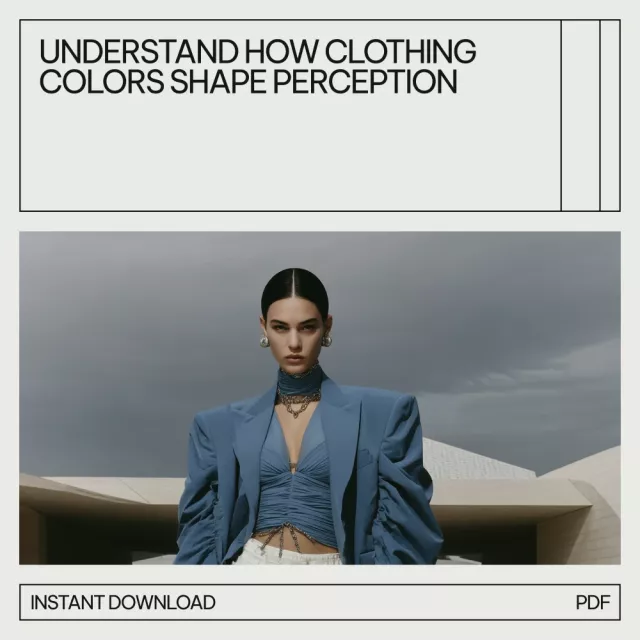
Color is often the first detail noticed in an outfit, shaping snap judgments and influencing how confident, approachable, or authoritative a look feels. Understanding the psychology behind color choices helps turn “I don’t know what to wear” into a repeatable system: pick colors that fit the situation, support the mood you want, and still feel like you.
Color lands fast. Before someone registers fabric, fit, or brand, the brain typically processes color as a shortcut for meaning. That’s why two outfits with the same silhouette can communicate different things based purely on hue, contrast, and saturation.
Color also loops back into self-perception. Wearing shades that feel “right” can increase the sense of being put together, which often improves confidence and follow-through—especially on high-stakes days. Observers, meanwhile, use color cues to guess traits like competence, warmth, creativity, or boldness. Those guesses aren’t always accurate, but they’re common enough to plan around.
Finally, intensity changes the message. A muted brick red reads grounded and mature, while a bright, high-saturation red reads louder and more attention-grabbing. The same “color family” can deliver different outcomes depending on how vivid it is and how strongly it contrasts with the rest of the outfit.
People often dress to steer their mood: calming neutrals when stressed, energizing colors when motivation is low, or familiar “safe” shades when the day feels unpredictable.
Signature colors create continuity. Minimalist black, coastal blues, earthy greens—these become a visual shorthand for a personal brand, helping outfits feel consistent even when pieces change.
Unspoken dress codes are powerful. Color helps align with a workplace, event, or community so you don’t stand out for the wrong reason (too formal, too loud, too casual).
Laundry habits, climate, lighting, and “what pairs easily” often decide color choices more than taste. A closet that coordinates reduces friction and makes getting dressed faster.
Instead of asking “What color looks good?” it helps to ask “What am I trying to signal here?” Use color like a volume knob—turn it up when you want visibility, down when you want ease and clarity.
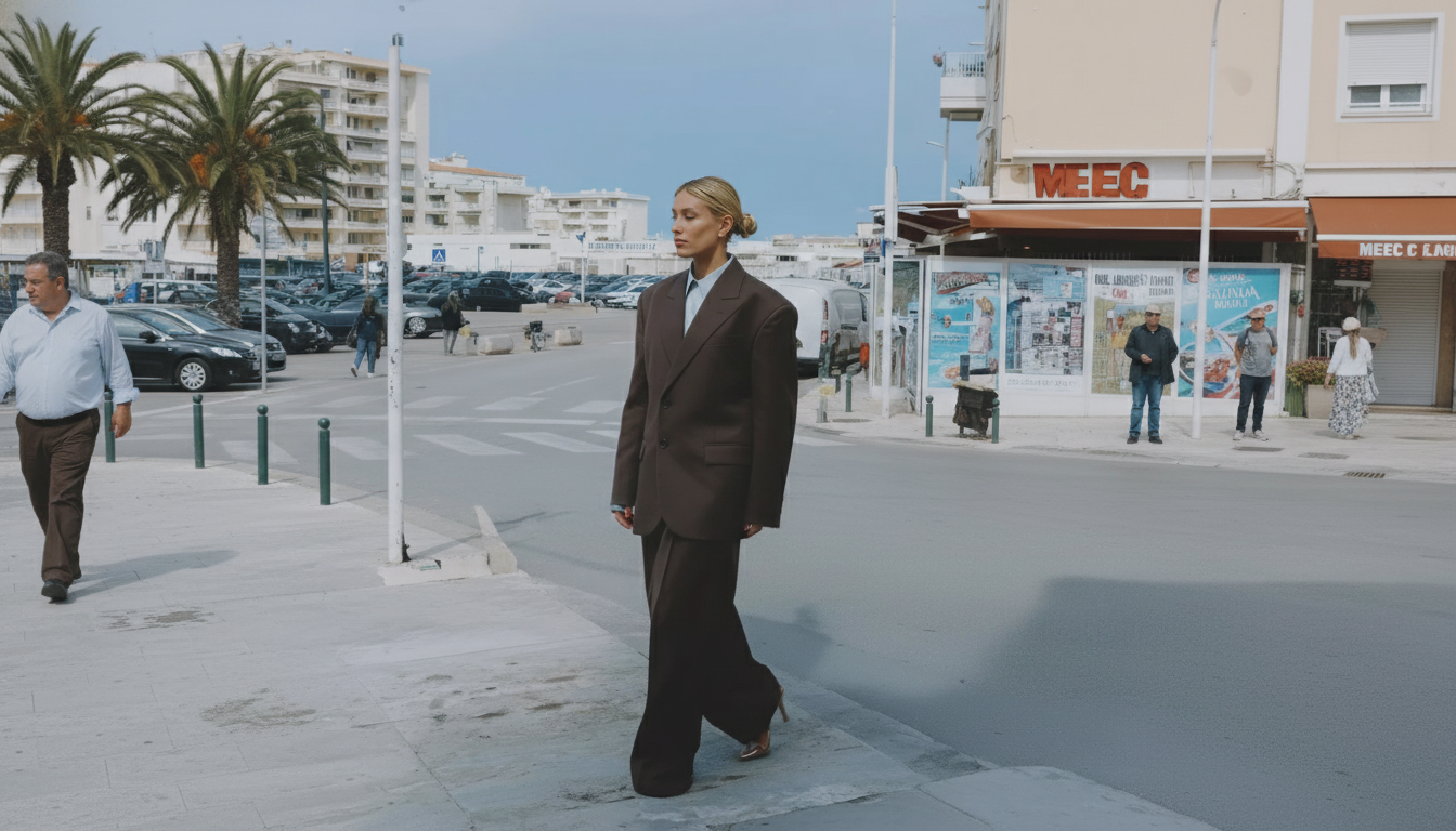
Prioritize clarity and reliability. Colors like navy, charcoal, and soft white support authority without feeling harsh. If black feels too severe, swap in deep navy or charcoal for similar structure with a softer edge.
Aim for approachability. High-contrast outfits (like black-and-white) can feel intense; soften them with a warm accent (tan belt, gold jewelry) or a lighter neutral (cream, dove gray).
| Color family | Common signals | Best for | Balance tip |
|---|---|---|---|
| Black/charcoal | Authority, sharpness, formality | Presentations, evening events | Add texture (knit, suede) or a warm accessory to avoid feeling severe |
| Navy/blue | Trust, calm, competence | Interviews, client meetings | Pair with off-white or soft gray to keep it modern, not corporate |
| White/cream | Clarity, cleanliness, simplicity | Minimal looks, warm-weather outfits | Use varying shades (ivory, ecru) and layers to prevent flatness |
| Red/burgundy | Energy, confidence, attention | Events, statement moments | Keep the silhouette simple; use one red focal point (top, lip, shoe) |
| Green/olive | Balance, growth, groundedness | Everyday wear, creative workspaces | Combine with neutrals and metal accents to avoid looking overly casual |
| Yellow/mustard | Optimism, visibility, playfulness | Social settings, accessories | Use as an accent near the face if it flatters; pair with denim or navy |
| Purple/plum | Individuality, richness, creativity | Dressy casual, artistic contexts | Anchor with black, charcoal, or deep brown for sophistication |
If you prefer a ready-made framework, Psychology Behind Color Choices in Style – 3-in-1 Bundle organizes the essentials into a core guide, a deeper eBook for scenarios, and checklists designed for quick outfit planning and closet edits.
Because mood and mindset affect style choices, pairing a color system with a simple mindset routine can make it easier to follow through. The Positive Attitude Starter Pack complements a wardrobe reset by supporting consistency—especially during stressful weeks when decision fatigue tends to spike.
Color associations are not magical guarantees, but patterns are real enough to be useful. Research reviews like Elliot & Maier (2014) on color psychology discuss how perceiving color can influence psychological functioning, while resources such as the Pantone Color Institute explore how color meaning and use show up across design, branding, and culture.
Often, yes—because the brain processes color quickly and attaches cultural associations before details like fabric are evaluated. Saturation and contrast also influence whether a look reads confident, intense, soft, or approachable, but outcomes are probabilistic rather than guaranteed.
A practical palette is usually 2–3 neutrals, 2 energy colors, and 1 signature accent. Keeping it small makes outfits repeatable, and a simple rule helps: add a new color only if it works with at least three items you already own.
Try a different undertone (burgundy instead of tomato red), adjust saturation (dusty instead of bright), or move the color away from the face. Accessories are a low-risk way to keep the message of a color without forcing it into a large garment.


Leave a comment