
Color often speaks before introductions happen—especially in interviews, first dates, networking, and on-camera meetings. The right shade can make you read as composed, approachable, decisive, or creative before you say a word. The Color Signal Pack for First Impressions (3-in-1 digital bundle) brings color theory down to earth with three practical tools—Color Me True, Colors That Speak Before You Do, and The Color Playbook for Interviews—so you can build a repeatable “go-to” color strategy for high-stakes moments.
First impressions form quickly, and color becomes an instant shortcut people use to infer traits like confidence, warmth, authority, or openness. That doesn’t mean color is a magic trick—it simply works fast because the brain processes visual cues before it processes detailed information.
Color also doesn’t work alone. Fabric (matte vs. shiny), fit (structured vs. drapey), grooming, and the setting (office lighting vs. daylight vs. webcam) either amplify or soften the signal you’re sending. The goal isn’t rigid rules; it’s alignment—consistency between what you intend to communicate and what your outfit communicates at a glance.
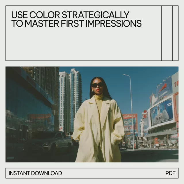
If you want one high-impact adjustment, focus on the color closest to your face. A top, blazer, scarf, tie, or even lip color can change how bright your eyes look, how even your skin appears on camera, and how “clear” your overall presence feels.
Start with shades that support your natural coloring so your skin looks healthier and your features look clearer. When a color clashes, people often describe it as “washed out,” “sallow,” or “tired”—even if you slept eight hours.
Then choose colors that cue the trait you want to lead with in that moment: trustworthy, approachable, decisive, calm, creative, or energetic. This is where most people get stuck because they have “favorite colors,” but not “job-to-be-done colors.”
Finally, adjust saturation, contrast, and formality for the context—interviews, client meetings, presentations, or social settings. The win is repeatability: a small set of reliable color formulas you can reach for under pressure (travel days, last-minute invites, surprise video calls) without second-guessing everything.
Use the guide below as a starting point, then refine based on industry norms, role seniority, and whether the setting is in-person or on-camera. Prioritize colors closest to the face for the strongest perception impact, and balance bold colors with neutrals so the message feels intentional rather than overpowering. When uncertain, aim for “quiet confidence”: medium saturation, clean lines, and one controlled accent.
| Color family | Common impression | Best used for | Easy pairing |
|---|---|---|---|
| Navy / deep blue | Trustworthy, composed | Interviews, client meetings, presentations | White, light blue, gray, camel |
| Charcoal / gray | Practical, steady, professional | Conservative industries, serious discussions | Crisp white, jewel tones |
| Black | Powerful, sleek, formal | Evening events, high-contrast looks, structured outfits | White, metallics, strong accent color |
| White / ivory | Clean, clear, minimal | On-camera calls, fresh first meetings, polished basics | Navy, tan, denim, bold accessories |
| Red / berry | Assertive, energetic | Pitch moments, leadership presence, statement accents | Neutrals; keep silhouette simple |
| Green | Balanced, grounded | Approachability in meetings; calm confidence | Navy, cream, brown, gold |
| Purple / plum | Creative, distinctive | Creative roles, networking, personal branding | Gray, black, navy |
| Yellow / warm gold | Optimistic, friendly | Casual networking, daytime events, subtle accents | Denim, navy, white |
The Color Signal Pack for First Impressions (3-in-1 digital bundle) is designed to connect color theory to practical outfit decisions. Instead of defaulting to whatever is trending or whatever happens to be clean, it helps you move from “favorite colors” to “effective colors” for interviews, meetings, networking events, and everyday confidence—without turning your closet into a complicated project.
If you also want a simple mindset companion for high-pressure days (like interview week or a big presentation), the Positive Attitude Starter Pack pairs well with a streamlined color plan: fewer decisions, less second-guessing, and a clearer “show up as yourself—on purpose” routine.
For a broader look at how humans process color and why perception can vary, see Britannica’s overview of color. For research perspectives on color psychology, browse resources from the American Psychological Association (APA). For workplace-focused thinking on professional perception and first impressions, explore topic coverage at Harvard Business Review.
Avoid extremes that distract, like neon or overly bright shades, and avoid colors that look too casual for conservative industries. On camera, skip tones that wash you out; a supportive neutral plus one controlled accent is usually the safest, strongest approach.
Yes—color is one of the fastest visual cues people process, and it can shape perceptions of trust, authority, and approachability. The effect is strongest when color aligns with great fit, grooming, and the expectations of your industry and culture.
Start with near-face items like tops and scarves, test warm vs. cool and light vs. deep, then choose 2 neutrals and 3 core colors you can repeat. Even one new top or scarf in a more flattering shade can change the overall impression of an existing outfit.


Leave a comment