
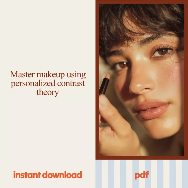
Contrast is one of the fastest ways to make makeup look intentional: it explains why certain shades, depths, and finishes look “right” on a face and why others can feel overpowering or disappear. This 4-in-1 pack organizes contrast into practical steps—so everyday looks, photos, and event makeup can be planned with fewer trial-and-error purchases.
In makeup, “contrast” is the visible difference between light and dark areas and between distinct colors. Products can either increase those differences (for more definition) or soften them (for a more blended, understated effect). Your natural contrast shows up in how deep your hair reads against your skin, how pigmented your lips look bare, and how defined the eyes appear without mascara or liner.
Makeup contrast is created through depth (light to deep), temperature (warm vs. cool), saturation (muted vs. bright), and finish (matte vs. shine). When those levers are balanced, features look harmonious across changing lighting—daylight, office lighting, flash photography, and evening settings. For a quick refresher on how color relationships work, resources like Encyclopaedia Britannica’s overview of color and the Adobe Color wheel are helpful references.
| Natural contrast level | Common traits | Complexion products | Brows & eyes | Lips & cheeks |
|---|---|---|---|---|
| Low | Soft feature definition; small value difference between hair/skin; muted overall effect | Sheer-to-light coverage; avoid overly deep contour; choose gentle bronzer depth | Soft brow definition; taupe/brown liners; diffused shadows | Muted rosy/peach; lip tints; avoid very stark, deep lip lines |
| Medium | Noticeable definition; moderate value difference; can wear both soft and bold looks | Buildable coverage; moderate contour/bronzer; flexible highlight placement | Defined brows; deeper crease shades; liner intensity adjusted by occasion | Balanced pigments; mid-depth lip colors; blush can be soft or sculpting |
| High | Strong feature definition; larger value difference (e.g., dark hair/light skin); bolder structure reads well | Medium-to-full coverage as desired; contour and bronzer can be deeper; sharper placement works | Crisp brow shape; darker liners; stronger lash definition; higher depth shadows | More saturated or deeper lips; stronger blush shades; clean edges often look polished |
Instead of treating contrast like a vague “soft vs. dramatic” label, the pack breaks it into repeatable decisions you can apply to face, eyes, and lips. The goal is consistency: knowing what to deepen, what to soften, and where definition matters most so makeup doesn’t read flat.
Contrast is easiest to spot in natural light. Start simple and focus on what’s most obvious before you overanalyze undertones or trend shades.
If you want a deeper dive into how hue families interact, Pantone’s color education resources can help clarify why some combinations read calm while others feel high-energy.
Contrast planning works best when each feature “agrees” with the overall intensity. That doesn’t mean every feature must be equally bold; it means the focal point is chosen on purpose, and the supporting features are adjusted to match.
Cameras often reduce dimension, so slightly stronger definition (brows, lash line, and cheek structure) helps features look clear. The key is adding definition while controlling harsh edges so the look stays clean rather than heavy.
Yes—bold tends to look most harmonious when there’s one clear focal point (like a stronger lip or a defined eye) and the surrounding features stay softer. Choosing slightly muted versions of bold shades can keep the impact without overpowering the face.
Value contrast is light vs. dark (depth), like using a deeper liner to define the lash line. Color contrast is hue or temperature differences, like pairing warm cheeks with a cooler lip or using complementary tones to make eye color stand out.


Leave a comment